Packaging Identity · Confectionery · Packaging · 2026
Earthly Delights
A candy world built from paper, pattern, and a deliberately decadent brand system.
Packaging study
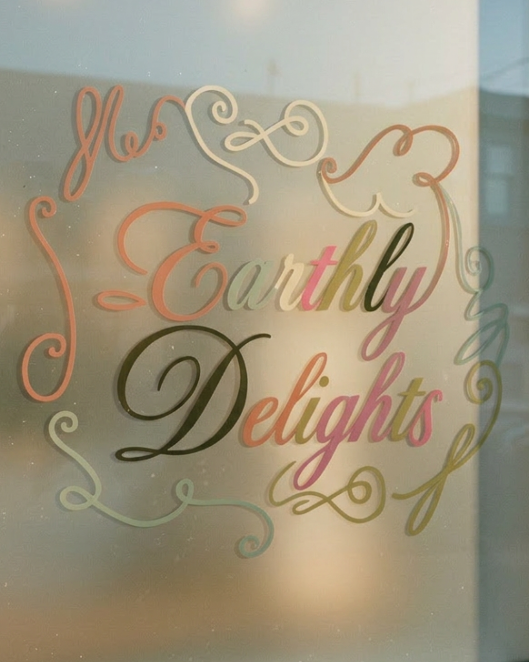
Plate 01 · The wordmark
Ornamental script · hand-built
Disciplines
- Packaging Design
- Brand Identity Design
- Art Direction
- Concept Development
- Material Studies
- Print Design
Industry
Confectionery · Packaging
Year
2026
Overview
Earthly Delights is a candy packaging project built as a full brand world rather than a single box. The identity pairs an ornamental custom wordmark with Helvetica Neue World Bold for the supporting typographic system, creating tension between softness and structure.
From wrappers and box fronts to hanging retail bags, flavor naming, brand identity design, and art direction all work together as one cohesive confectionery language. Every touchpoint was designed to feel tactile, romantic, and just a little theatrical.
Custom paper textures, translucent tissues, layered pattern studies, and softly aged color all push the work beyond packaging graphics into a more immersive sensory system.
§ The Problem
What they came to us with.
The challenge was to create a candy brand that felt distinctive and fully authored from every angle, without leaning on nostalgia clichés or mass-market sweetness. It needed to feel collected, tactile, and editorial — something precious enough to keep, not just unwrap and discard.
§ The Approach
How we answered.
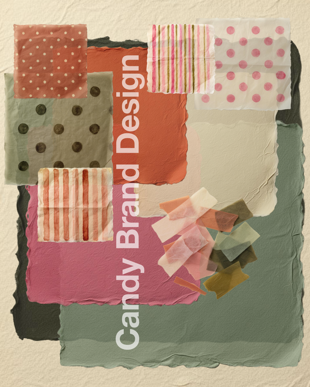
We built the concept from the material language outward: torn paper edges, translucent tissue overlays, ornamental linework, restrained confectionery photography, and a palette of warm cream, rose pink, terracotta, sage, muted gold-olive, and olive-black. The result is a packaging identity system with enough depth to support multiple flavors, retail formats, and brand moments while still reading as one cohesive world.
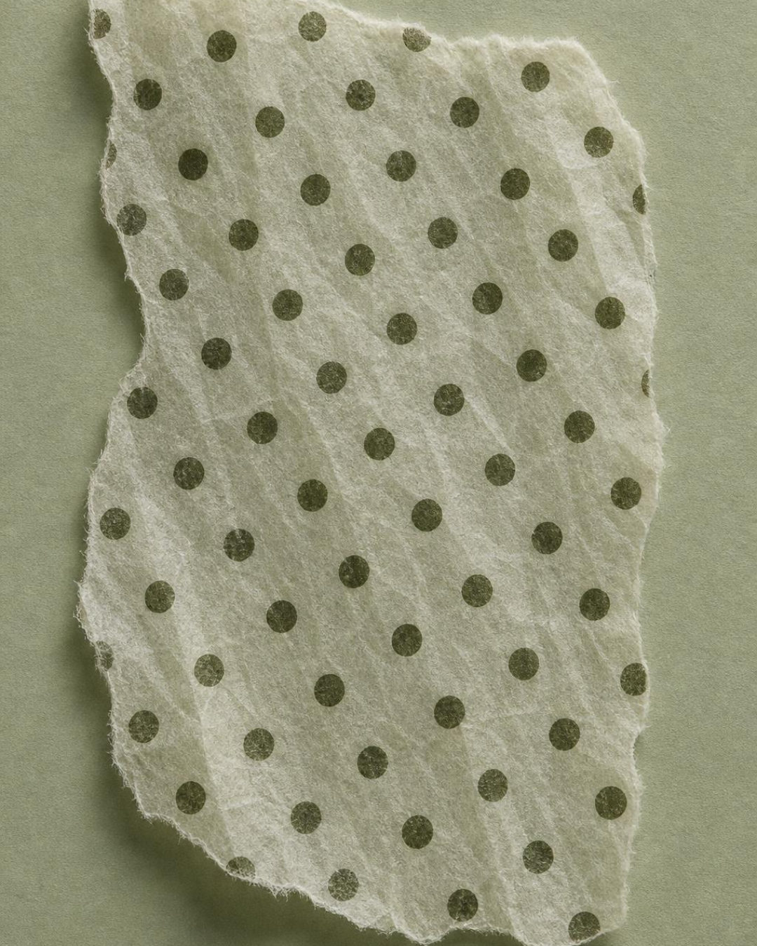
§ 01 — Material language
Built from paper,
not from pixels.
Torn deckle edges, translucent tissue, ornamental linework and softly aged colour. The whole brand world starts as something you can hold.
§ 02 — The range
Fifteen
flavors.
Five boxes.
Fifteen flavours across five curated boxes, three in each. Every box is built as a small collection, with the three flavours chosen to complement and pair with one another.
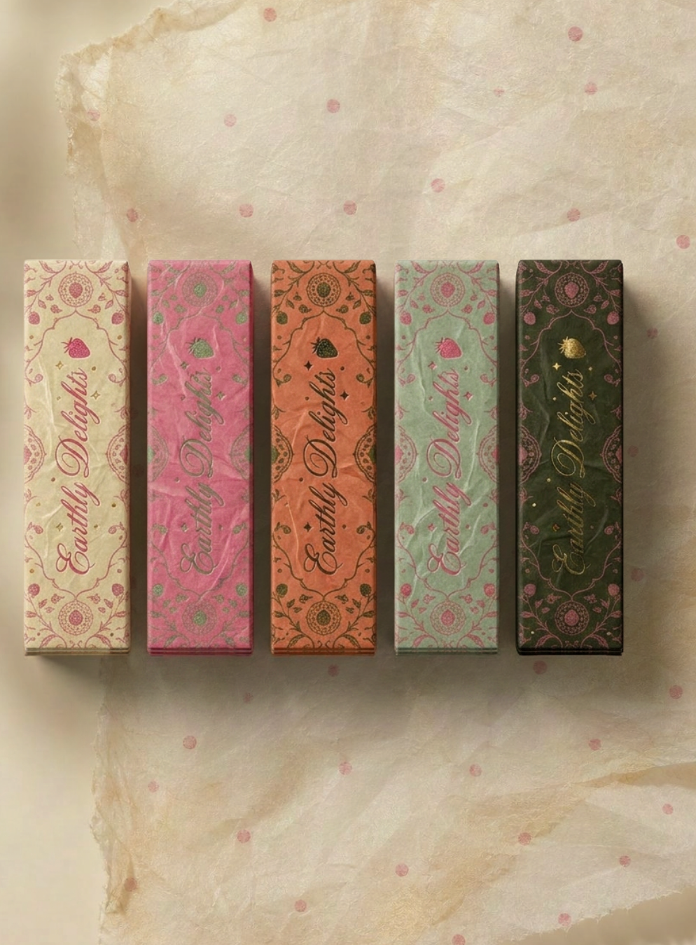
The flavour index
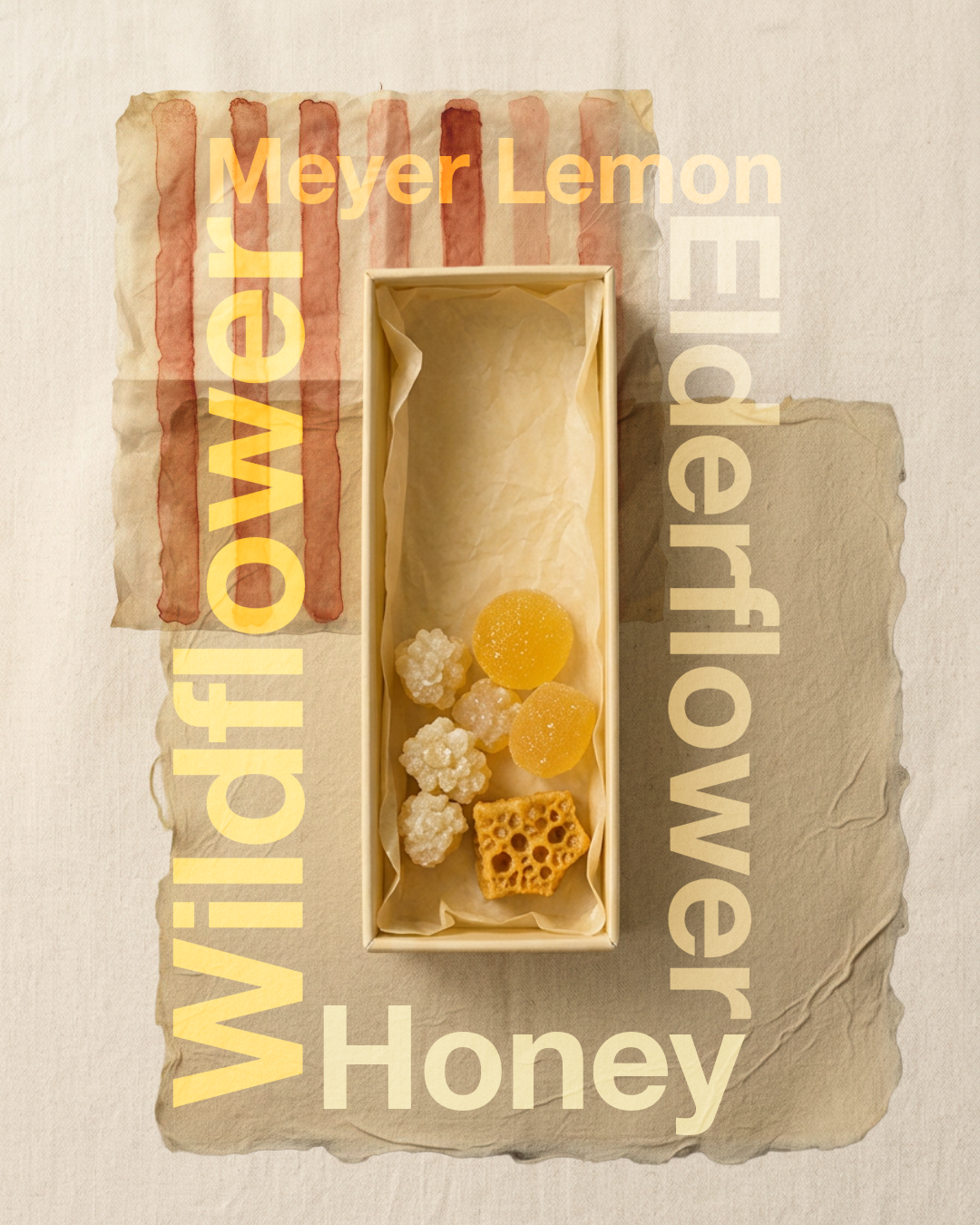
Meyer lemon · elderflower
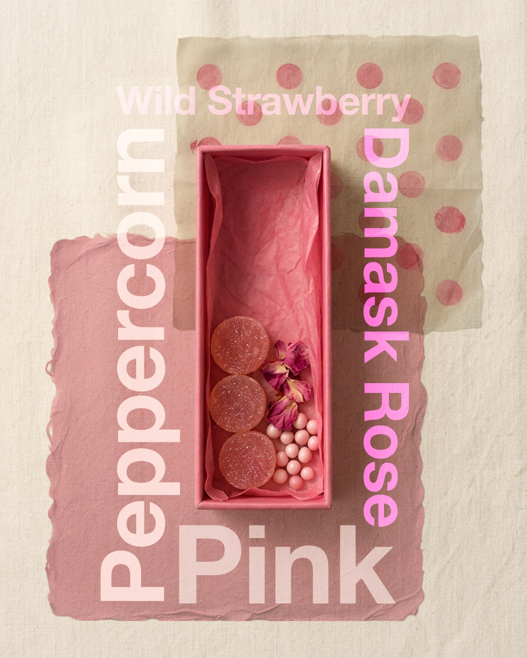
Peppercorn · wild strawberry

Green cardamom
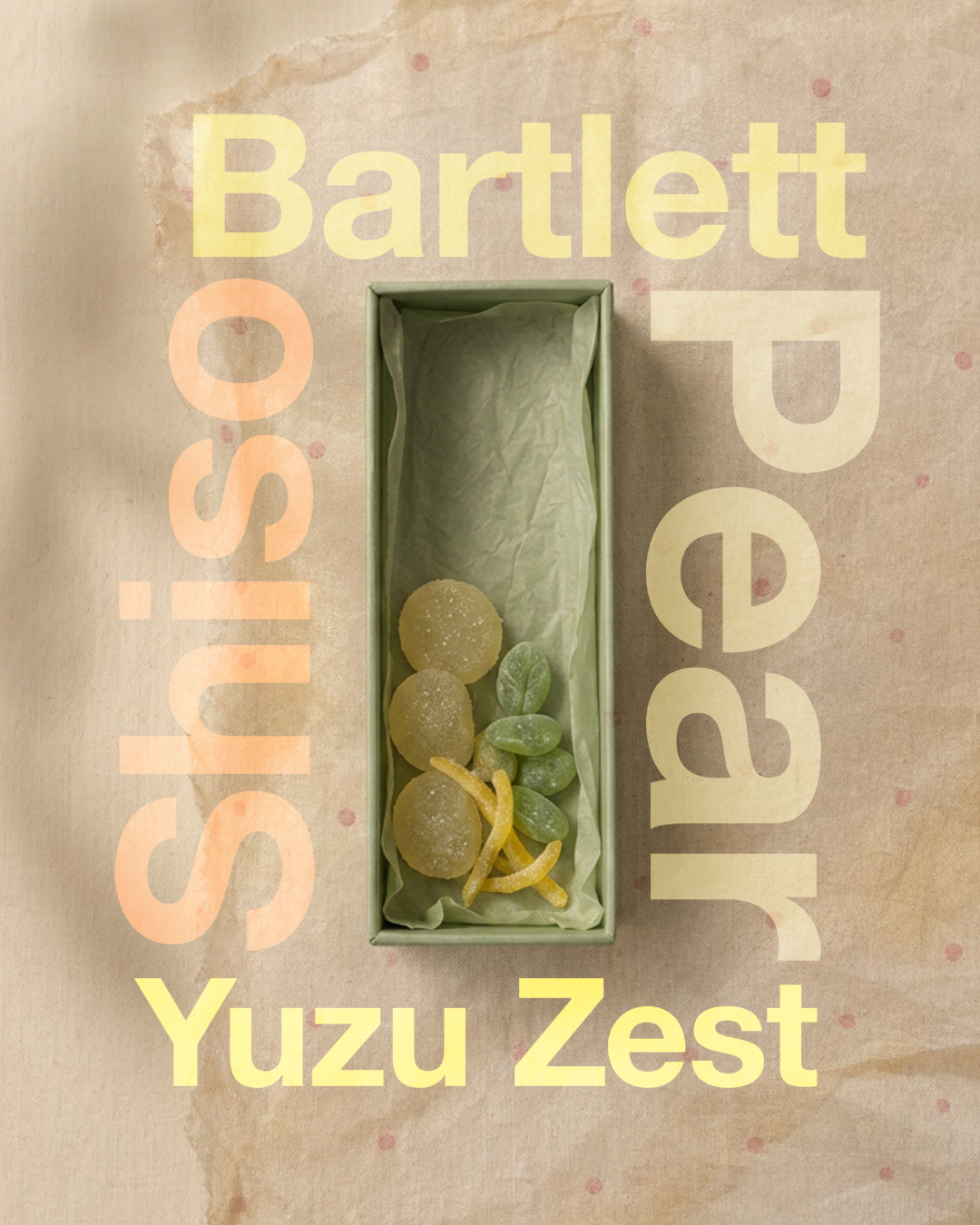
Shiso · yuzu zest
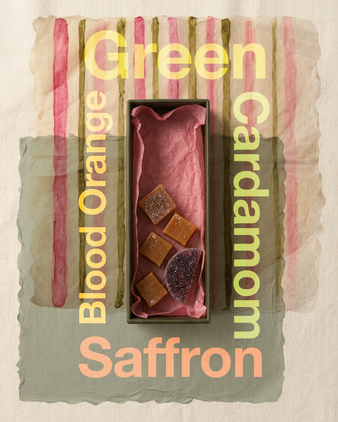
Blood orange · saffron
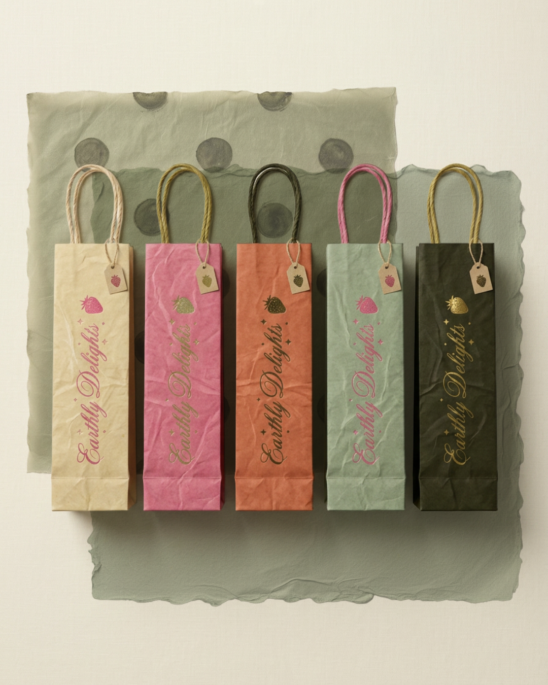
§ 04 — Retail format
Made to hang. Built to be kept.
Tissue-lined hanging bags translate the same system into a take-home object precious enough to save.
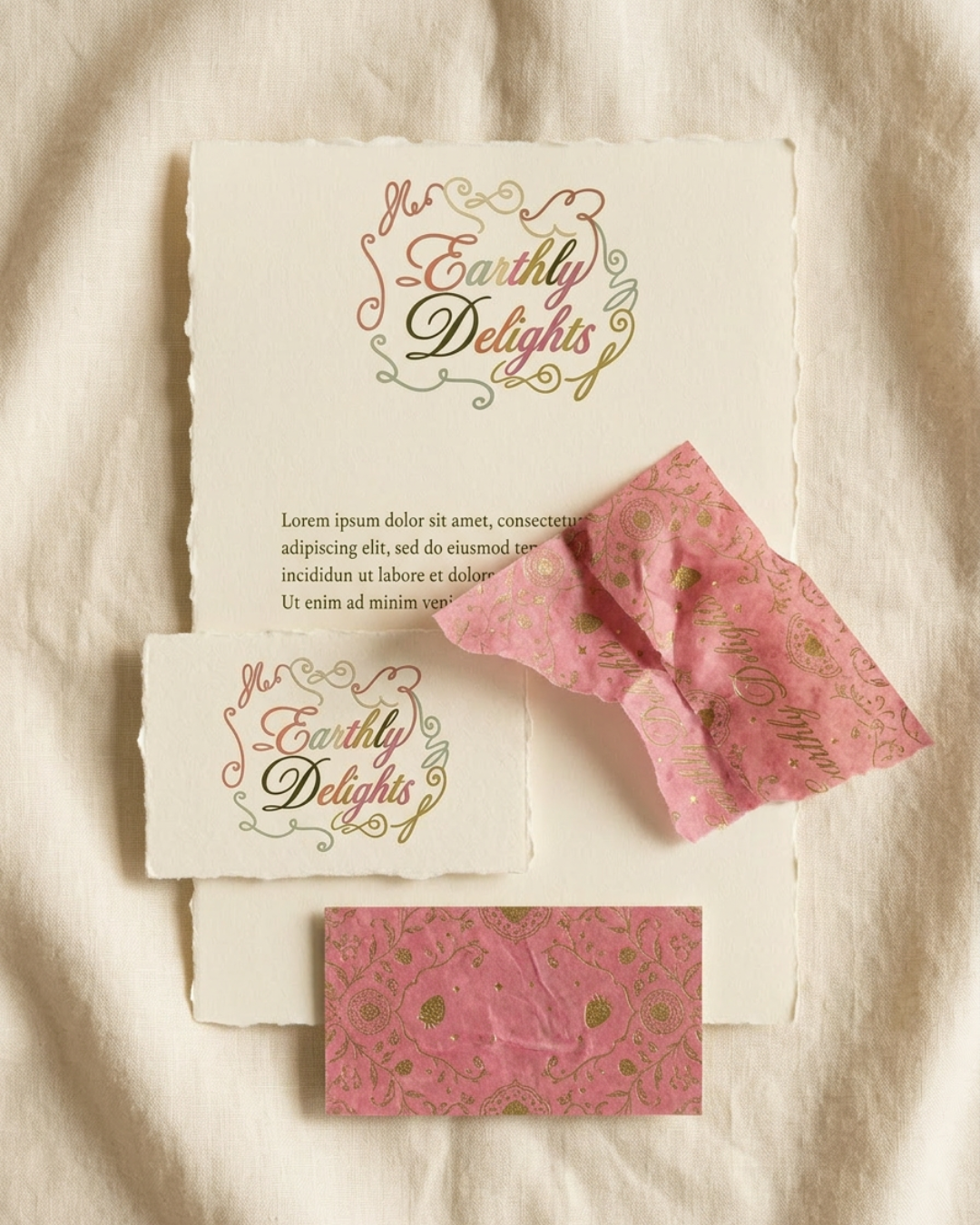
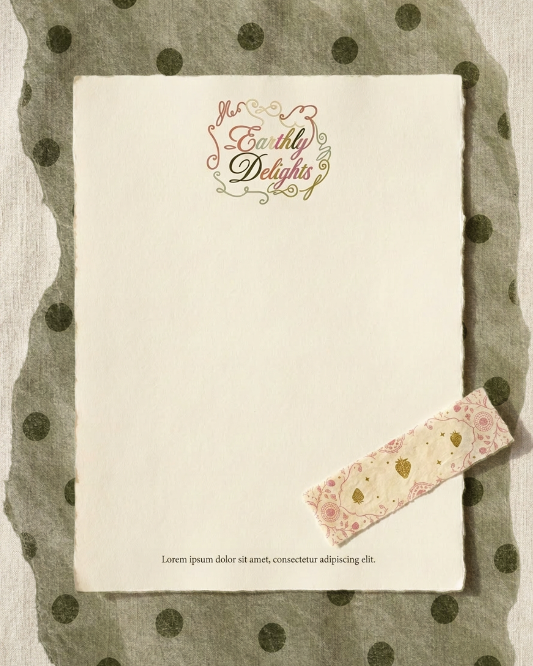
§ 05 — Print & stationery
One ornamental language, end to end
§ Outcome
Type system
Custom wordmark + Helvetica Neue World Bold
Scope
Packaging · Identity · Art Direction